
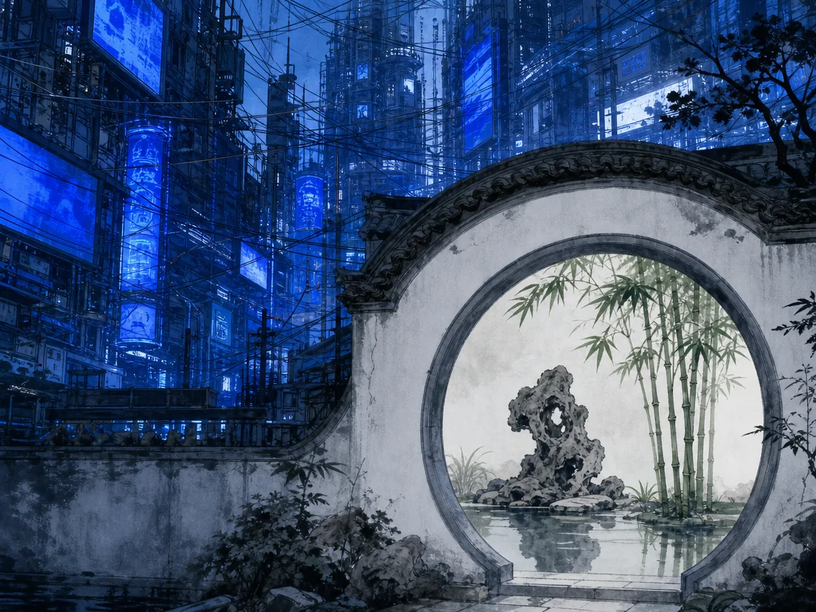
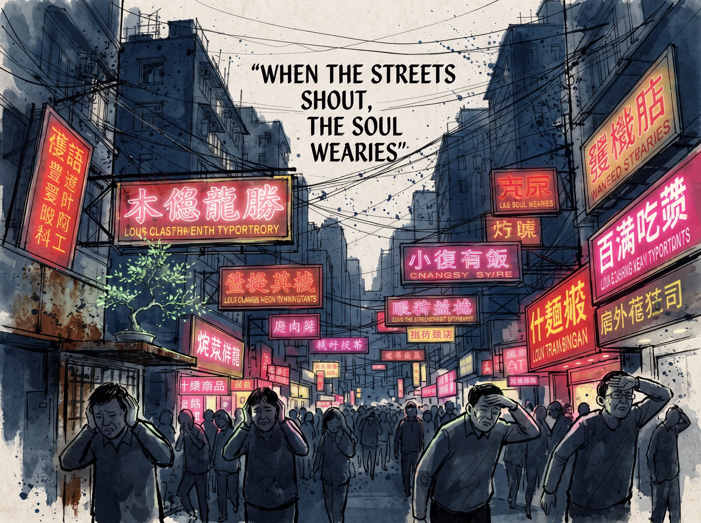
Walk down a street in many Chinese cities today, and your eyes rarely rest. Red banners hang across intersections. Pastel high-saturation floodlights wash over centuries-old architecture. Signs compete for attention at every turn. It is easy to feel subtly drained — or even anxious — in these spaces without knowing why. What makes a city loud is not only volume; it is the visual insistence that never stops asking you to look, to read, to react.
This feeling is not imagined. Dense signage, busy traffic, and crowded public environments create visual clutter that increases competition during early visual processing [2]. Larger, more prominent objects then overwhelm smaller details, making them harder to detect. In other words, an overstimulating environment does not just feel stressful; it may actually tax your perception. Recognizing this is the first step toward designing spaces that nurture calm instead of demanding constant attention—a foundational perspective explored in Chinese Aesthetics in Urban Design.
Ancient Chinese thought offers a clear response. Long before modern environmental psychology mapped the effects of sensory overload, Daoist and Confucian traditions were already examining how environment shapes the mind and how restraint can be a form of beauty. The question is not simply whether banners and neon lights are ugly. The deeper question is what kind of relationship a city cultivates between people and their surroundings.
Chinese Aesthetics in Urban Design: When Cities Shout
The discomfort many people feel in visually saturated public spaces is real, yet it is rarely named. We normalize it because we live in it. But normalization is not the same as design intention.
Visual noise operates like a low-grade alarm. Banners with imperative language, high-contrast colors, and overlapping messages create a sense of urgency that has little to do with the individual walking past. This is not about preferring one aesthetic over another; it is about recognizing that environments communicate values. A city that shouts prioritizes transmission over contemplation. A city that whispers prioritizes presence over performance.
Some contemporary observers have noted that when a visual style originally built for ideological messaging is repurposed for commerce — discount signs draped across historic facades, promotional banners layered over monuments — the result often feels dissonant rather than dynamic. That friction is not accidental. It is the visible gap between a design logic meant for mass communication and a public space meant for human life.
Cities designed for human scale do not disappear under visual demand. Think of narrow lanes where signage is minimal, courtyards where architecture leaves room for shadow and silence, or pathways lined with trees rather than screens. The difference is not merely stylistic. It is philosophical: what a space assumes about the person moving through it.
A Historical Lens: Soviet-Influenced Planning and Public Aesthetics
The visual culture many Chinese cities inherited includes layers from the mid-twentieth century, particularly Soviet-influenced planning and artistic training. After 1949, large-scale technical aid from the Soviet Union reshaped many aspects of urban development in China. One of the most documented examples is the urban planning work of Soviet expert Nikolai Mikhailovich Mulin, who arrived in China in April 1952 and contributed through September 1953 [1]. During his time in China, he helped draft an early version of the national urban planning design procedures and personally prepared preliminary planning schemes for cities such as Hangzhou and Shanghai [1].
These efforts were part of a broader model in which Soviet urban planning treated the city as a functional machine, organized around production zones, worker housing, and efficient circulation. Residential compounds surrounded by main roads — sometimes called micro-districts — were designed to serve collective needs rather than individual experience. The aesthetic of this era carried similar priorities: bold geometry, monumental scale, and imagery built for clarity and mass impact rather than quiet reflection.
Public posters, banners, and propaganda art from that period share this logic. They favor strong colors, direct language, and compositions built to be read quickly at distance. These choices made sense for their original purpose. They do not necessarily make sense when applied indiscriminately to streets, parks, and heritage sites meant for daily human use.
It is also worth noting that Soviet aesthetics continue to surface in unexpected places today. Some Chinese video games and interactive media draw on Soviet-era visual styles, and younger audiences sometimes express nostalgia for that graphic language. Nostalgia and functional dissatisfaction can coexist. People may appreciate the energy of certain visual traditions while still recognizing that those traditions were not designed with individual calm as their goal.
What Was Lost: The Chinese Aesthetic of Restraint
Before Soviet-influenced planning entered Chinese cities, a very different aesthetic tradition was already at work. Classical Chinese art, architecture, and garden design have long prized simplicity, implicit meaning, and the careful use of empty space. Ink paintings do not fill every corner of the scroll. Classical gardens do not overwhelm the viewer with ornament; they guide the eye through pauses, pathways, and framed views. Calligraphy values breath between strokes as much as the strokes themselves.
This cultural instinct toward restraint is not about decoration. It is about perception. Traditional aesthetics understood that leaving room is not the same as leaving nothing. Empty space allows the mind to settle, to move, to participate rather than be instructed.
Soviet realist training, by contrast, emphasized technical accuracy, heroic idealization, and didactic clarity. These are different goals, not merely different styles. One tradition trains the eye to see and judge; the other trains the eye to rest and imagine. Both can be powerful. But when the language of mass messaging replaces the language of contemplative space, the result is often visual exhaustion rather than visual enrichment.
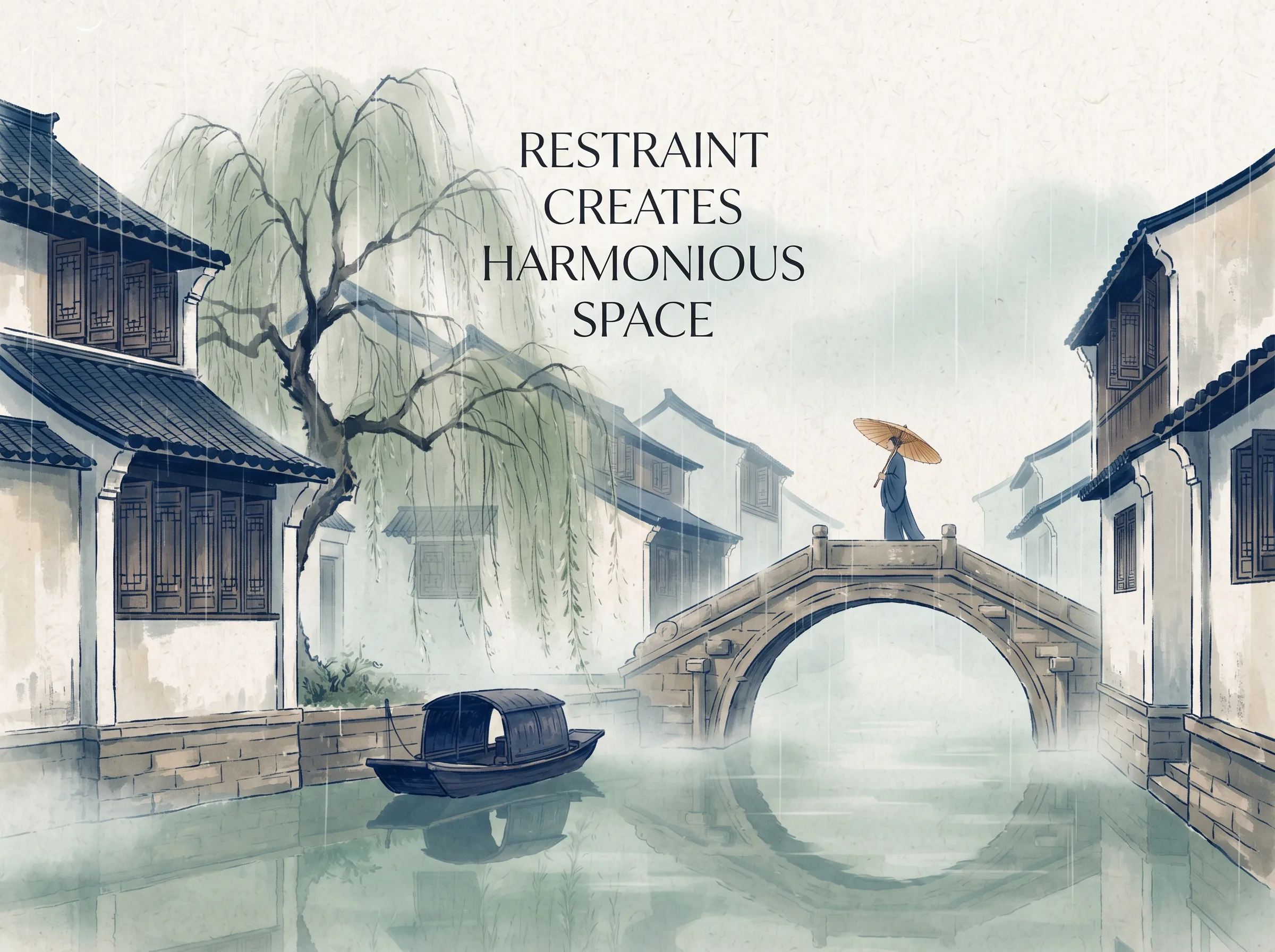
Traditional Chinese aesthetics also held that beauty emerges through relationship, not accumulation. A wall, a gate, a courtyard, a view of sky — each gains meaning from what it does not include. When designers treat every available surface as something to fill, they risk turning public space into a screen rather than a place. Examine this artistic principle further through the classical aesthetic philosophy of What Can Ancient Chinese Aesthetics Teach Us About Living a Calmer, More Intentional Life Today?.
Daoism: The Wisdom of Visual Simplicity
One of the most direct ancient reflections on sensory overload comes from the Daodejing. In Chinese Aesthetics in Urban Design, Laozi writes that "the five colors blind the eye" The point is not that color itself is bad. The point is that excessive visual stimulation dulls perception rather than sharpening it. When everything is bright, nothing stands out. When everything demands attention, attention collapses into noise.
Daoist philosophy treats simplicity as both a spiritual discipline and a practical design principle. This ideal of simplicity or restraint (jian, 简) is not about deprivation. It is about removing what obscures. A clear stream does not need decoration. A quiet room does not need distraction. A well-designed street should not need to shout.
Modern research on visual clutter supports a conclusion that Daoist thinkers reached through observation and reflection: environments overloaded with competing visual signals increase cognitive load and reduce the ability to process smaller details [2]. What classical texts describe as blinding the eye, contemporary psychology describes as attentional fatigue. The languages differ; the concern is the same.
This insight has direct implications for urban design. If excess sensory input degrades perception, then restraint becomes a form of care. Choosing fewer banners, muted lighting, and clear spatial hierarchy is not an aesthetic preference alone. It is a commitment to making environments easier for the human mind to navigate.
Confucianism: Balance and Appropriateness in Shared Space
While Daoism warns against excess, Confucianism asks where and when something belongs. The “doctrine of the mean” (zhongyong, 中庸) is frequently misunderstood as mediocrity. In its original context, it refers to measured, appropriate action suited to a specific situation. It is not about finding a midpoint between extremes. It is about choosing what fits.
Applied to public space, this means asking: does this banner belong here? A slogan outside a government office carries a different weight than the same slogan draped across a Tang-dynasty temple wall. A memorial site requires a different visual tone than a commercial street. Confucian sensitivity to ritual propriety (li, 礼) and harmony (he, 和) suggests that context matters more than consistency.
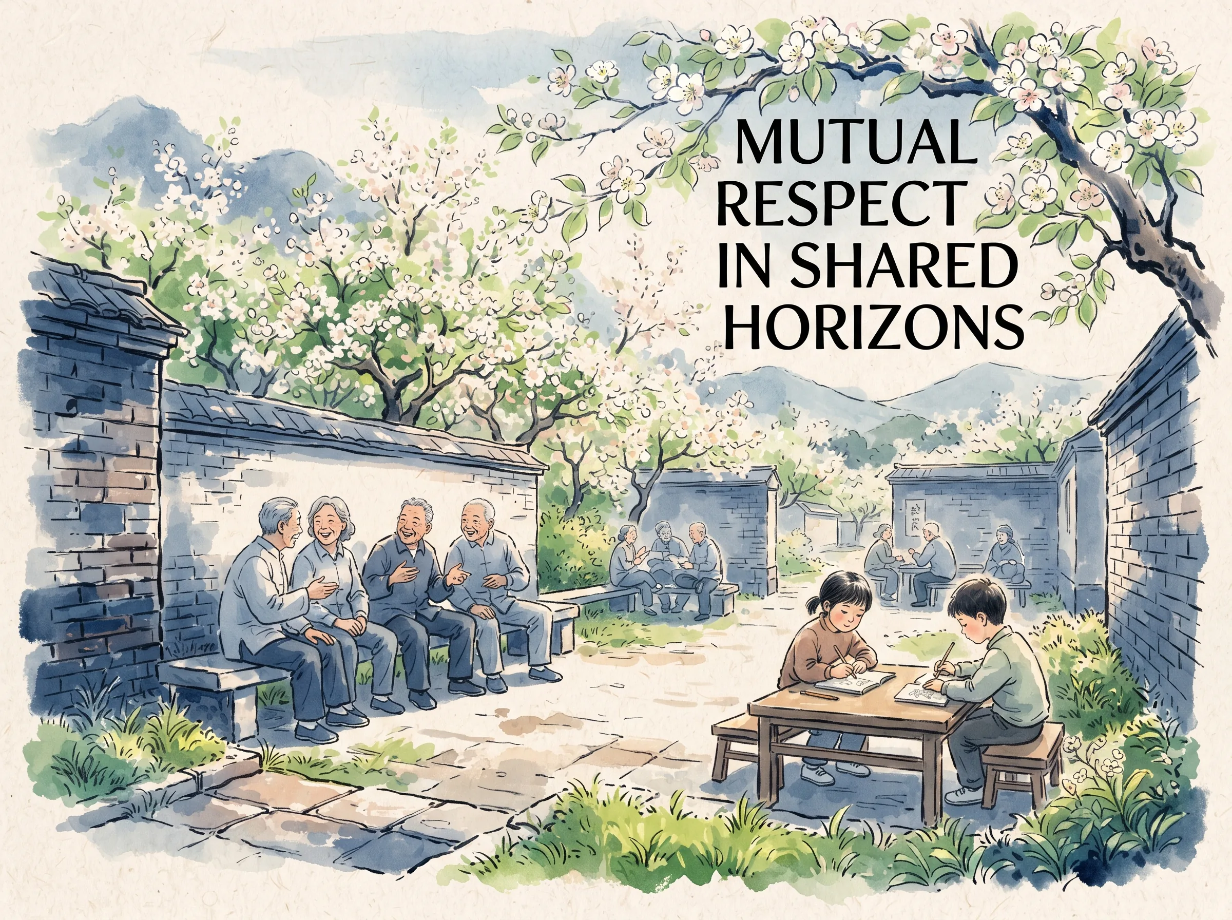
This does not mean every location needs its own custom visual policy. It means designers should read a place before filling it. A street can be energetic without being aggressive. A park can be informative without being instructional. The goal is not to ban public messaging but to align it with the character of the space and the dignity of the people moving through it.
In practical terms, this might look like:
- Limiting banner density in heritage zones
- Using scale and typography that respond to building height and street width
- Allowing negative space to function as design, not absence
- Treating public illumination as atmospheric rather than promotional
Balance is not the removal of all tension. It is the calibration of tension so that a space can serve multiple purposes without demanding constant obedience.
Designing for People, Not Ideologies
The classical Chinese ideal of harmony between humanity and nature (tian ren he yi, 天人合一) is often summarized as ecological balance. But it also contains a design ethic: environments should serve human flourishing, not abstract systems.
Soviet-inspired planning optimized for efficiency, production cycles, and collective mobilization. Individuals were positioned as workers within a larger mechanism. This model produced results — housing, infrastructure, industrial growth — but it did not always prioritize the subjective experience of the person walking home.
A people-first approach does not reject function. It asks whether function includes rest, reflection, and unstructured movement. Narrower streets slow pace. Restrained signage reduces cognitive load. Spaces for silence allow the mind to recover. These are not luxuries. They are prerequisites for well-designed public life.
Some contemporary urban design discussions in China reference traditional aesthetics as a counterweight to hyper-visual commercial environments. Whether these references translate into lasting policy change remains an open question. What is clearer is that the public appetite for calmer, more legible spaces is growing.
Practical Wisdom: Cultivating Calm in a Noisy World
Ancient wisdom is not a replacement for good urban planning. But it can shape how individuals experience and respond to their environment. A few small practices can make a noticeable difference:
Notice what calms you. Walk a familiar route slowly. Which buildings hold your attention without demanding it? Which signs can you read without leaning in? Which spaces make you want to linger rather than hurry?
Seek out negative space. Gardens, temple courtyards, older neighborhoods with less advertising, and museums often preserve the aesthetic of restraint. Use them as reference points for what public calm feels like.
Question the default. When confronted with a wall of banners or flashing lights, ask what purpose the design serves. Is it informing? Persuading? Selling? Remembering? The answer often reveals why the space feels off.
Support design that serves people. Vote, comment, and choose businesses that respect architectural context. Public pressure is one of the few forces that consistently shapes urban aesthetics.
Practice visual simplicity (jianpu, 简朴). Apply the Daoist instinct for simplicity at home and in small gatherings. Fewer posters, fewer screens, more open wall. Calm environments often begin at the scale of personal choice.
None of these actions will redesign a city overnight. But they do shift the baseline. Each time someone chooses a quieter space, asks a critical question, or designs with restraint, the norm eddies slightly. Culture follows perception.
Where Soviet Aesthetics Still Echo
Soviet-influenced visual culture remains visible in many Chinese cities. Government buildings, university campuses, hospital notices, and residential compounds still carry the formal language of that era. The round official seal adopted in the 1950s is one small but widely encountered symbol of that aesthetic transfer. Housing typologies such as tube-shaped apartment buildings reflect a design philosophy that prioritized speed and affordability over spatial comfort.
These elements are not universally disliked. Many people associate them with stability, collective memory, or a period of optimistic modernization. Nostalgia is real, and it is legitimate. But nostalgia and critique are not opposites. A space can be cherished and still improved. A design style can be historically significant and still inappropriate in a new context.
The challenge for contemporary Chinese cities is not to erase Soviet-era aesthetics but to contextualize them. A memorial hall may retain its original graphic language without needing new promotional banners layered on top. A historic street may preserve its architecture without being covered in temporary advertisements. Clarity comes from matching design intent to spatial purpose.
Conclusion: From Noise to Nurture
The visual overwhelmingness of many Chinese streets is not a mystery. It is the visible residue of design philosophies built for mass messaging rather than human calm. Soviet-influenced planning and propaganda aesthetics left a durable imprint on public space [1]. Traditional Chinese philosophy, with its emphasis on restraint, balance, and environmental harmony, offers an alternative that has been present all along.
The goal is not to return to an idealized past. It is to recognize that visual culture shapes mental life, that clutter taxes attention, and that simplicity is a form of respect [2]. When cities design for people instead of ideologies, they do not lose power. They gain dignity.
If you feel unsettled by noisy public spaces, your response is reasonable. The next step is to act on that intuition — seek calmer environments, question inconsiderate design, and support work that treats visual restraint as a virtue rather than a limitation.
FAQ
Why do some Chinese streets feel visually stressful compared to streets in other countries? Many Chinese urban environments carry design conventions shaped by mid-twentieth-century Soviet-influenced planning and propaganda aesthetics, which prioritized bold messaging and mass communication [1]. These conventions were later adapted for commercial use, often layering high-saturation signage and banners onto streets not originally designed for that density of visual demand. Research on visual clutter shows that dense signage increases perceptual competition and can make smaller details harder to notice [2]. The result is not a matter of taste alone; it is a measurable effect on attention.
Is Laozi really saying that too much color harms perception? Yes. In Chapter 12 of the Daodejing, Laozi writes that "the five colors blind the eye," among related observations about sound, taste, and desire. The passage is commonly understood as a warning that excessive sensory stimulation dulls rather than sharpens perception. It is not an argument against beauty or color; it is an argument against sensory overload.
Does Confucianism have anything useful to say about urban design? Confucian thought emphasizes contextual appropriateness and social harmony. The “doctrine of the mean” (zhongyong, 中庸) is often misread as compromise; in its classical context, it means choosing action that is measured and fitting for a given situation. Applied to public space, this suggests that design should respond to the character of a location rather than applying a single visual template everywhere. A banner near a memorial site should be read differently than a banner in a commercial district.
Can ancient philosophy really improve modern cities? Ancient philosophy does not replace architecture or urban policy. But it offers a vocabulary for evaluating environments. Daoist restraint, Confucian appropriateness, and the classical ideal of harmony between people and surroundings all point toward the same conclusion: well-designed spaces reduce unnecessary cognitive load and support human well-being. Modern research on visual clutter supports this direction [2]. The two traditions — classical wisdom and contemporary science — converge on the same practical insight.
Examine this artistic principle further through the classical aesthetic philosophy of Why “Heaven and Humanity as One” Still Matters: What Ancient Chinese Aesthetics Can Teach Modern Life.
For a deeper comparative examination of these ideas, explore our related study on Cultivating the Self: The Harmony of Opposites and Wordless Teaching.
Sources & Further Reading
[2] Attention in Urban and Natural Environments – PMC — S2
Further Reading
- The Bilibili video essay by Sun Tuohai (孙拓海) discusses Soviet aesthetic influence on Chinese urban culture, public design, and visual nostalgia.
- Classical Chinese philosophy texts on Daoism and Confucianism offer extended discussions of simplicity, balance, and environmental harmony.
- Research in environmental psychology and visual cognition provides additional evidence on how built environments affect attention and stress.